 "this is not matt farah's foxbodymiata" (fantastic-mr-foxbody)
09/09/2015 at 01:39 • Filed to: can bad typography and layout be fatal?
 7
7
 8
8
 "this is not matt farah's foxbodymiata" (fantastic-mr-foxbody)
09/09/2015 at 01:39 • Filed to: can bad typography and layout be fatal? |  7 7
|  8 8 |
*watches page load*
*realizes the plague of the ‘you need reading glasses’ big not so friendly giant unformatted word hurl that is new kinja has descended on this last bastion of legibility*
*flips table*

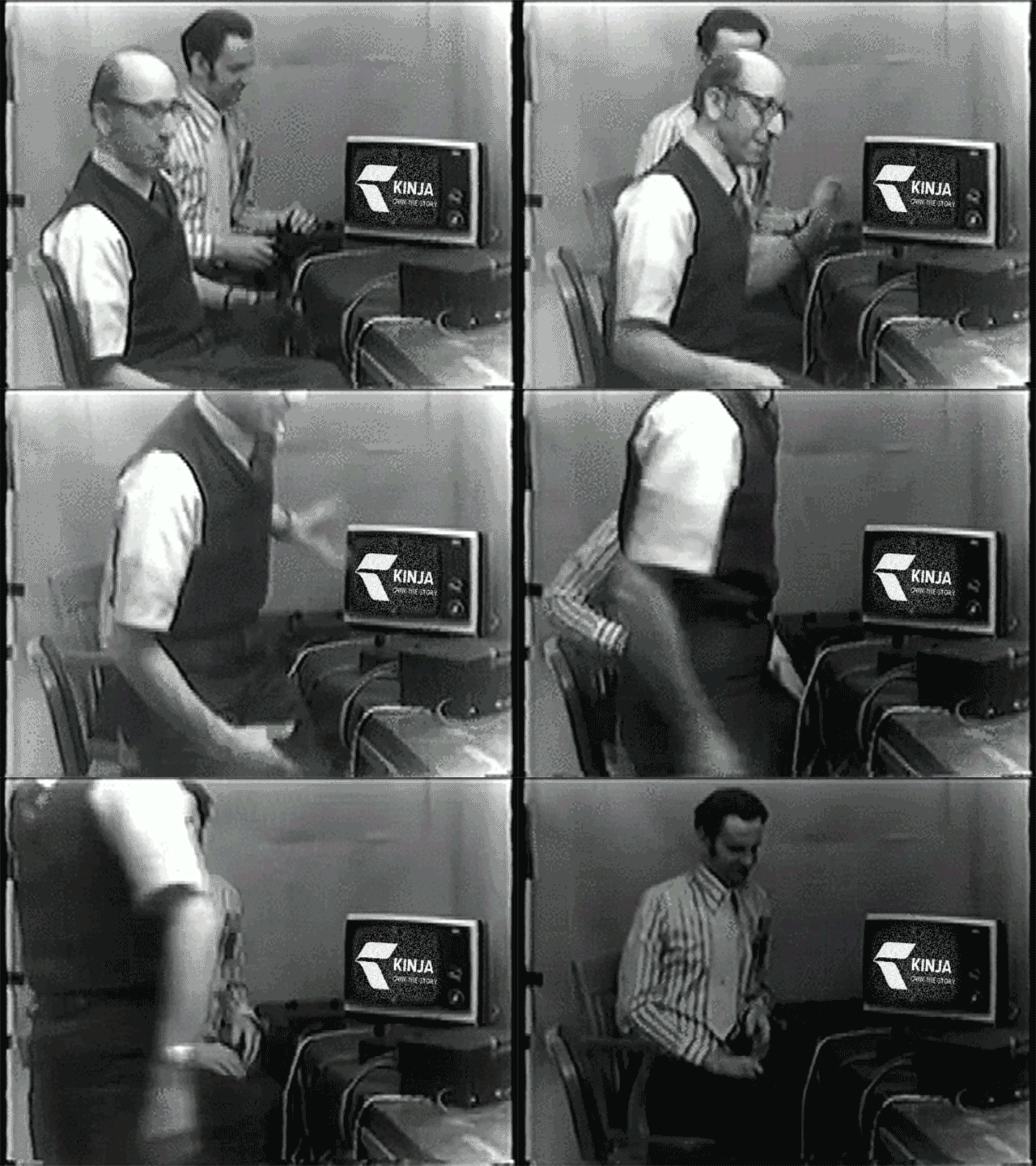
Angry nerd level: spent an hour making a kinja specific rage quit gif
 for Michigan
> this is not matt farah's foxbodymiata
09/09/2015 at 01:46 |
|
As a designer, I really don’t understand the current trend of “Let’s make everything gigantic on desktops/laptops, too”. It makes sense for phones, but they need to scale properly.
I have a 21” 1080p monitor and I can only see one article at a time on the FP, plus whatever is “trending” on the left side. When there’s an image in an article, I can’t see anything else.
Even if you scale it all down by zooming out, it’s ugly and awkward.
I’m not one to gripe about changes because they’re different, but this is a bad change.
 this is not matt farah's foxbodymiata
> for Michigan
09/09/2015 at 01:53 |
|
Preach. I have a feeling second rate companies like Kinja took a look at what Apple did with their current OS’s and software—flattening them out, getting rid of useless drop shadows and anachronistic three dimensional buttons, making better less obtrusive use of space with simple, elegant design, etc.
Thing is, they spent lots of time and lots of money to have the best designers and developers make it really work.
You can’t just replace functionality with text and white space and expect to have the same result. If you’re kinja, you also can’t say you’re trying to use space better by just making all the text bigger so that less fits on the screen and building a fatter sidebar that leaves a third of the screen blank once you scroll past it.
 for Michigan
> this is not matt farah's foxbodymiata
09/09/2015 at 02:10 |
|
As something of a minimalist, I love clean, straightforward design that avoids unnecessary visual metaphors. The current flat design trend is a welcome breath of fresh air after the baroque-like digital visual excess of the past 10+ years. But only to a point.
Now that everyone is doing it there are more bad applications than good. Oversimplification, excessive white space, and over-sized fonts are running rampant and I fear it’s going to kill a good trend faster than I would’ve liked.
We need more Jony Ive Apple, Microsoft Modern, and Google Material Design and less Kinja.
 m2m, apex detective
> for Michigan
09/09/2015 at 06:17 |
|
I took the questionable decision of getting a screen that could double as a TV just in case. 27” 1080p ... you can imagine how jolly big all this stuff is for me. ;)
 spanfucker retire bitch
> this is not matt farah's foxbodymiata
09/09/2015 at 06:58 |
|
Seriously, this shit right here is not how you do responsive web design. Look at the front page of ArsTechnica to see how you should do responsive web design. That properly scales between mobile and desktop/laptop.
This shit with Kinja is just god fucking awful. But I don’t expect anything better from them anyways.
 Urambo Tauro
> this is not matt farah's foxbodymiata
09/09/2015 at 10:02 |
|
Try reducing your zoom level. I use Chrome for browsing, and it remembers my preferred zoom for any website. I currently view Oppo @ 90%.
 for Michigan
> m2m, apex detective
09/09/2015 at 13:27 |
|
Oh my, that must be awful.
 this is not matt farah's foxbodymiata
> Urambo Tauro
09/09/2015 at 18:46 |
|
Yeah tried that, fits more main content on the screen... at the cost of annoyingly tiny menus, etc.